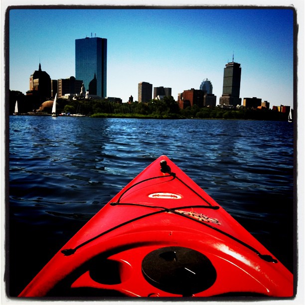
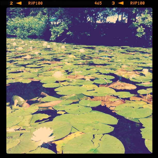
My long weekend hiatus turned into a full week off from blogging; sometimes you just need to step away from the computer to recharge. The past few days have been filled with relaxing, swimming, kayaking, and few cocktails for good measure. I’ve been snapping pics along the way, how have you been relaxing this summer?

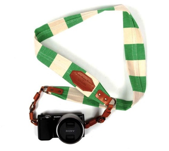
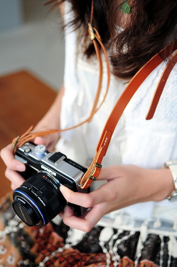
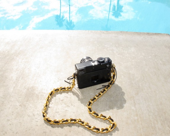
As a blogger, my camera accompanies me on almost all of my adventures and being the accessory hoarder that I am, I’m thinking my Nikon needs a little more pizzazz. So, I’ve been researching some new straps to dress up my camera. Even if I’m behind the lens, I still want to look chic! Which do you like? Preppy, classic, or glam?

Images via 1, 2, 3

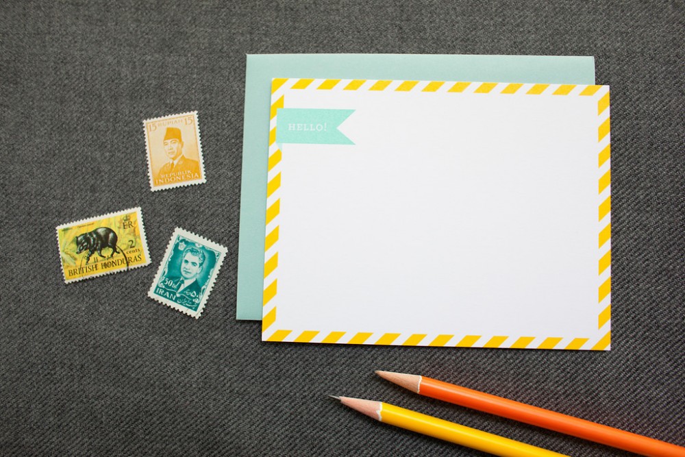
When I saw previews of the Fig. 2 Design greeting card line from the National Stationery Show I knew that I had to chat with designer and owner Claudia about her collection.  With the launch of her online store this week, Claudia is stopping by DomestiKatedLife to answer a few hard-hitting questions about what inspires her and how she manages to celebrate events big and small.
So Claudia, how did you start Fig. 2 Design?

Claudia: Fig. 2 started out of coincidence. After I left my full time job as a graphic designer at a local studio, I had planned on continuing with corporate and small business graphic design projects. But I had done a number of custom wedding projects and thought it would be fun to do more, so I sent a local bridal boutique a post card with the hopes they would refer me to brides. Little did I know that after meeting with them I would walk out with a request to design an entire wedding invitation collection. I was so flattered and excited!
What inspired this line?

Claudia:  The Fresh Collection wedding line is inspired by my imagination. I love to look at magazines and blogs that feature weddings, but I try not to look at any that feature a lot of paper products because I want to stay true to my aesthetic and not get too side tracked by what others are doing. So if I see that someone had a wedding on a farm and it was a small and cozy affair, I pretend I’ve been hired for that project and I design what I would have shown the bride and groom.
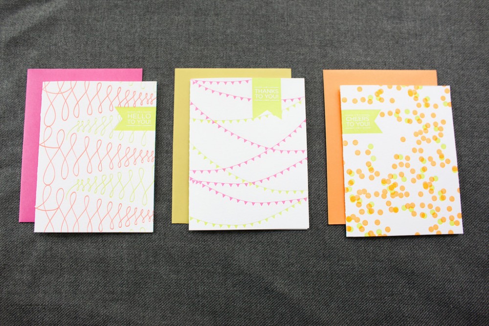
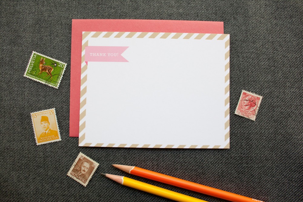
The Neon Card greeting card collection was inspired by a handbag I bought 2 years ago in London. I loved that it was a bright orange but didn’t realize it was neon until I used it for the first time. I got a ton of compliments on it and the next spring I saw another bag that had a touch of neon and fell in love with that one so I knew I had to use it on stationery. My style is fun and festive, but I also LOVE type and calligraphy so I came up with 3 series of cards. First is the Festive Fluorescents that incorporates confetti, pennants, and swirls. For the pattern series, I was inspired by one of my husband’s dress shirts. I love pattern but it has to be bold. That said, fluorescents aren’t for everyone, so I thought pairing the classic patterns with just a tough of neon and some fun phrases would suit anyone. For the final series, the calligraphy set, I collaborated with Michele of Meant to Be Calligraphy. We’d worked on a few things together and I knew our styles would work well together.
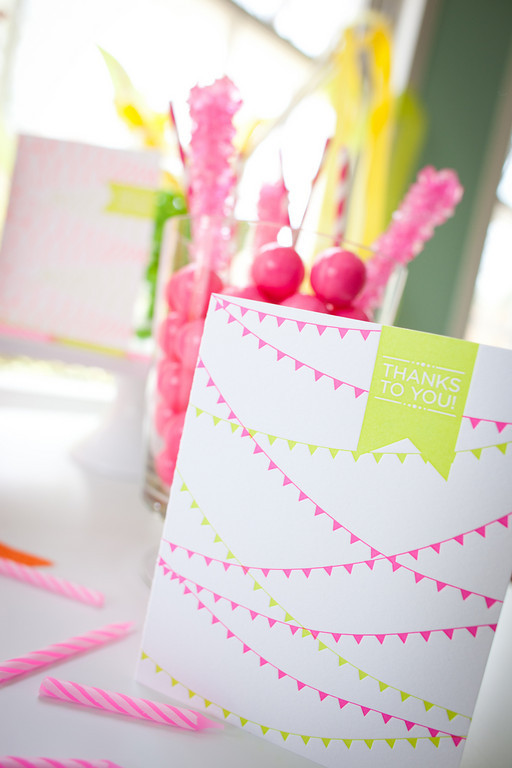
Your products are so festive; do you have any tips for how to throw a fabulous celebration?

Claudia: My best tip for a fabulous celebration is to be yourself! If you’re not comfortable, it will show. Concentrate on what you do best. Whether it’s making fun cocktails, killer flower arrangements, or amazing food. And definitely wear something fun and festive! Even if you have a simple dress, wear some fun accessories! I love big flower pins from Emersonmade, any of the cute sparkly goodies from Ban.do, or chunky necklaces from J.Crew or Anthropologie. And of course, fabulous shoes.

There are so many adorable cards in your new line, do you have a favorite?

Claudia: A favorite? Maybe the neon confetti! I love confetti! What’s more fun than colorful sprinkles? There’s nothing wrong with celebrating something every day. It doesn’t have to be someone’s birthday, it could be as simple as enjoying a mani-pedi with my best friend.

Thanks so much for stopping by Claudia! You can check out these cards and more of her collection in Claudia’s newly launched shop: Fig. 2 Design Studio
Happy Father’s Day to the best Dad in the world; thanks for always being there to give me a boost!

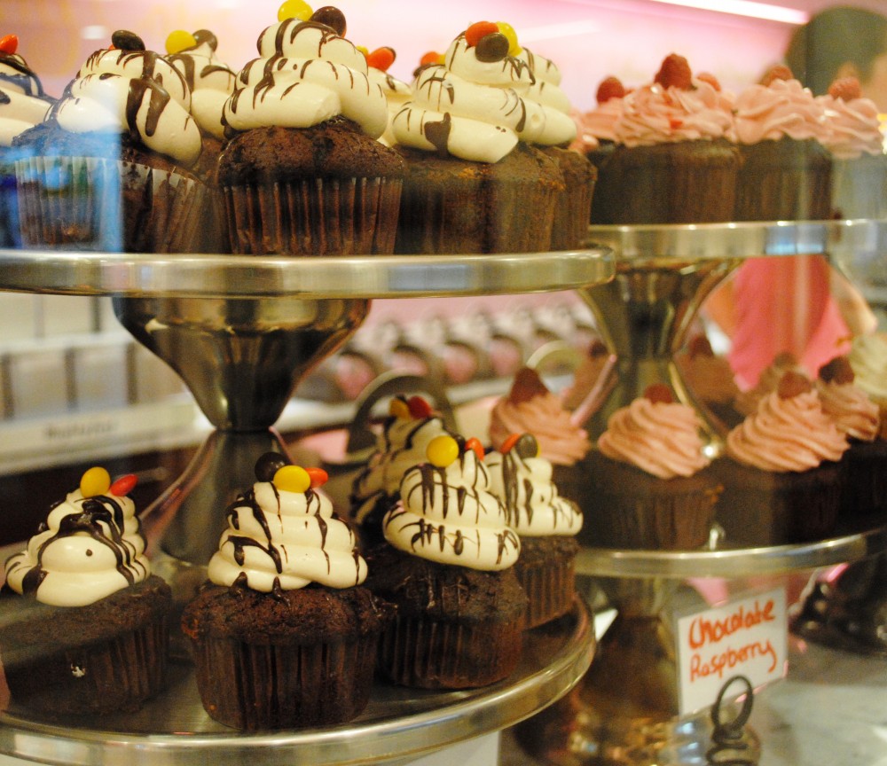
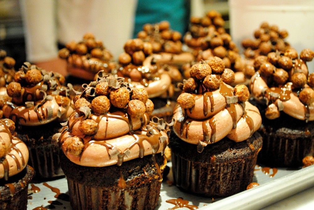
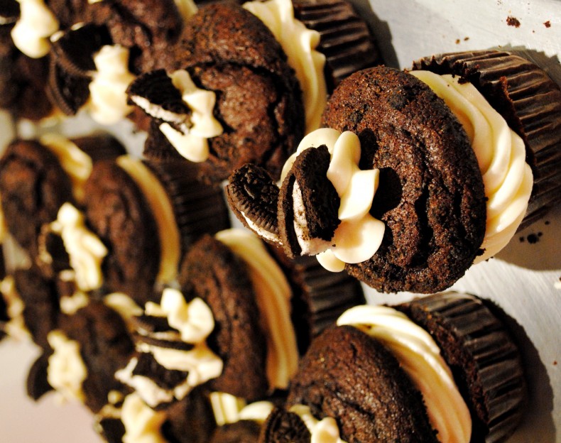
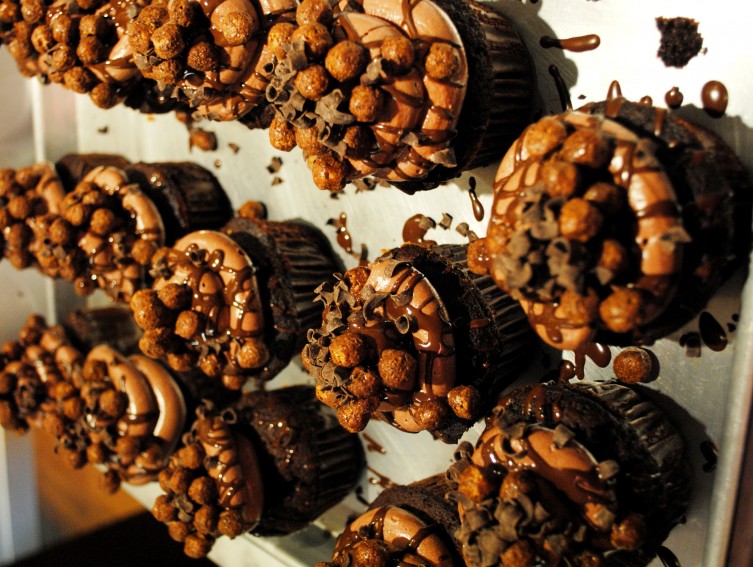
Earlier this week I took a cupcake decorating class with my friend at Isabelle’s CurlyCakes in Beacon Hill. I learned invaluable skills like how to fill cupcakes with mousse, how to pipe icing, and how to speed eat cupcake scraps left on the counter.

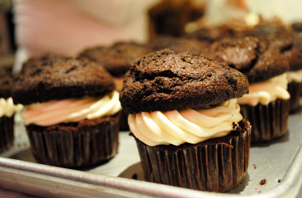
We made Oreo cupcakes (with Oreo bits baked into the cake! and Oreo icing!), red velvet cupcakes, peanut butter cupcakes, oh and triple chocolate cupcakes that were filled with chocolate mousse, iced with chocolate frosting, drizzled with chocolate ganache, and dipped in cocoa puffs. Hungry yet? You will be after you see how decadent they look:

And if you’re not in sugar shock yet, click over to 101 Things I Love and read my guest post about baking Oreo treats!

PPS: Have you entered the Coral and Pearl earring giveaway? Click here to enter.

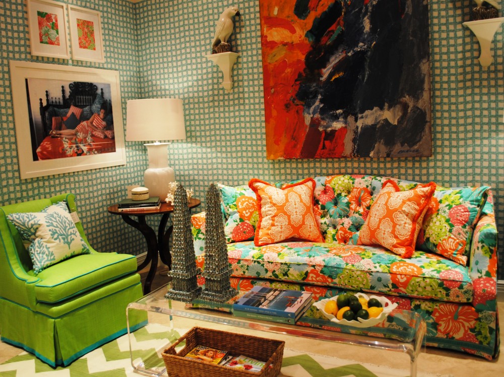
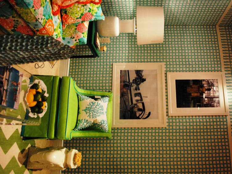
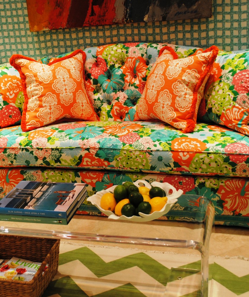
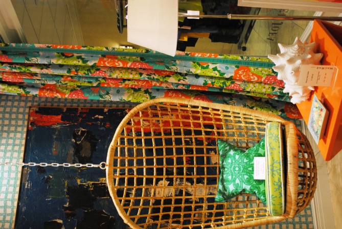
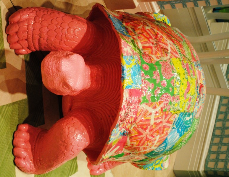
Possibly my favorite event of Blogfest was the Lilly Pulitzer for Lee Jofa preview. A preppy girl at heart, I melted walking into the showroom. There were so many patterns and colors  — the tassle-trim wallpaper border around the room with the chevron rug and all of the florals — and yet they played off each other so well. The showroom even featured a giant turtle that had a Lilly-patchwork motif modge-podged onto the shell!

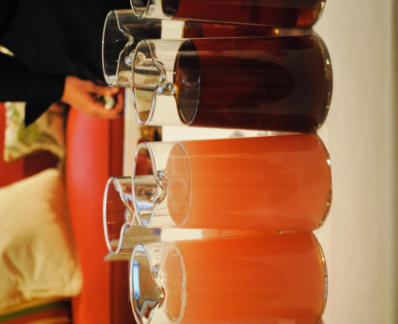
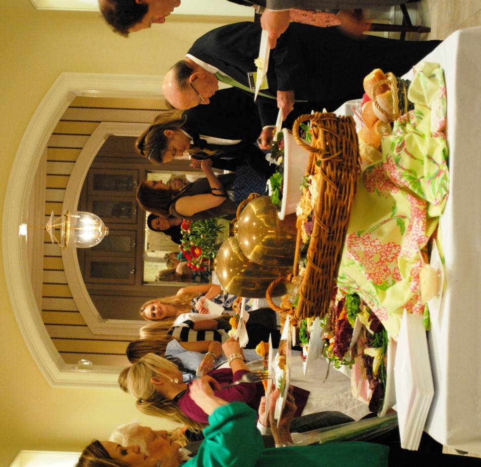
Following the preview of the collection we had a very Lilly-inspired lunch in the showroom, complete with pink lemonade — a nod to Ms. Pulitzers juice-days. Given my penchant for spilling, I was quite nervous to be eating around all those gorgeous fabrics and show furniture! 

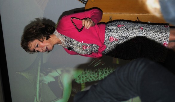
I finished the day listening to esteemed designer Barbara Barry present her new collection for Kravet called Indochine. She came off incredibly intelligent and passionate, and I loved hearing about where she draws her creative inspirations from.  I was sad to have to duck out early before the rest of the festivities but am incredibly grateful for such an amazing two days meeting great designers, creatives, and bloggers.

My first stop on day two of Blogfest was at the Kips Bay Showhouse; it was my first time so I was really excited to see some of the amazing designers featured. I’ll be the first to admit that not all of the rooms were my cup of tea, but that’s what’s so interesting about this event — there really is something for everyone, from traditionalists to modernists and everything in between.

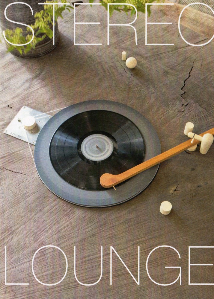
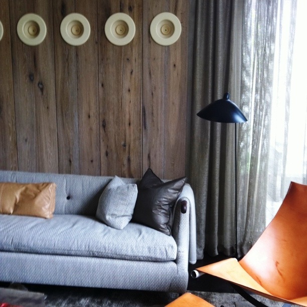
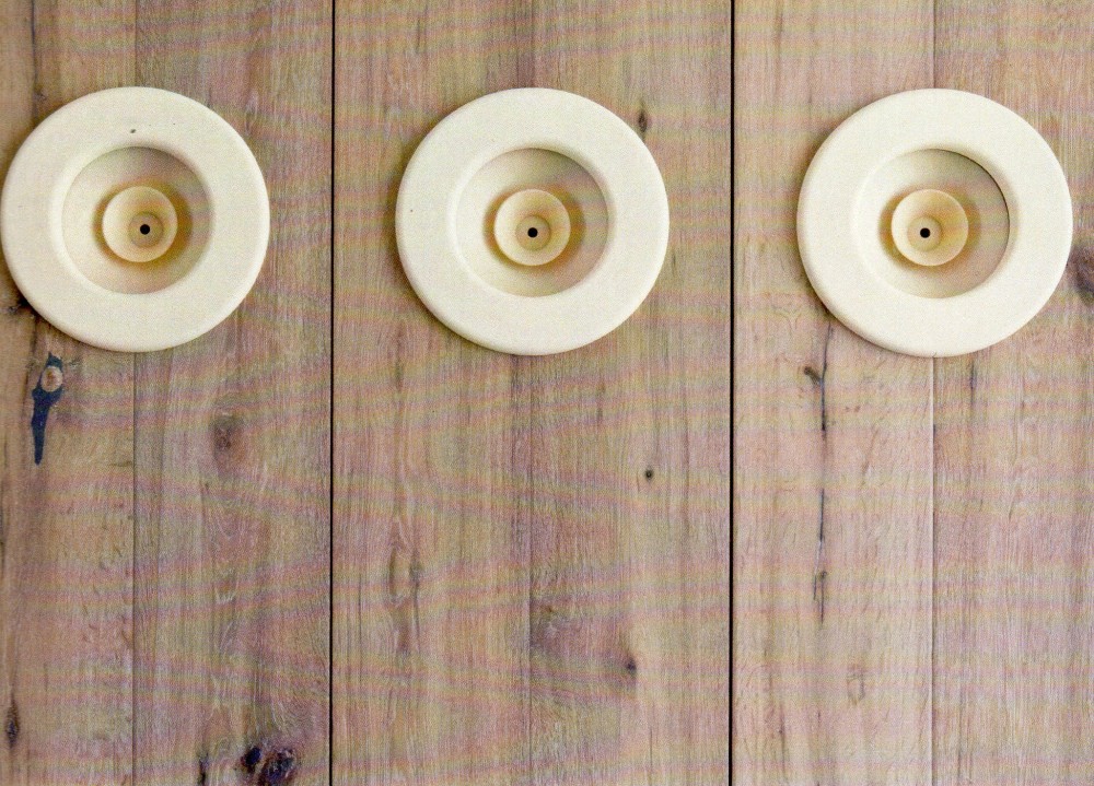
I had two favorite rooms, and one of them definitely fell into the “hip” category: the stereo lounge designed by Brad Ford. I’m always looking for ways to hide electronics but this design beautifully embraced the stereo speakers and equipment and made it the focus of the room. The round white speakers almost looked like art on the walls, and I loved how a record player was actually built into the giant wooden coffee table.

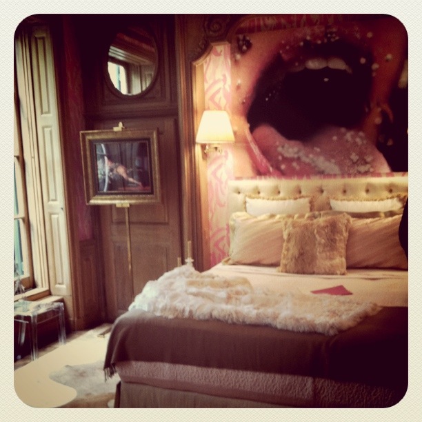
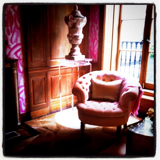
Another one of my favorite rooms was on the opposite end of the decorating spectrum, total femininity and opulence, designed by Amanda Nisbet. The pink wall coverings and loud artwork were bold choices with an already ornately trimmed room.

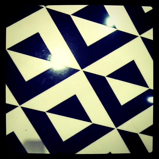
And how about this flooring? It’s all in the details…

Image 1 and 3 via Brad Ford
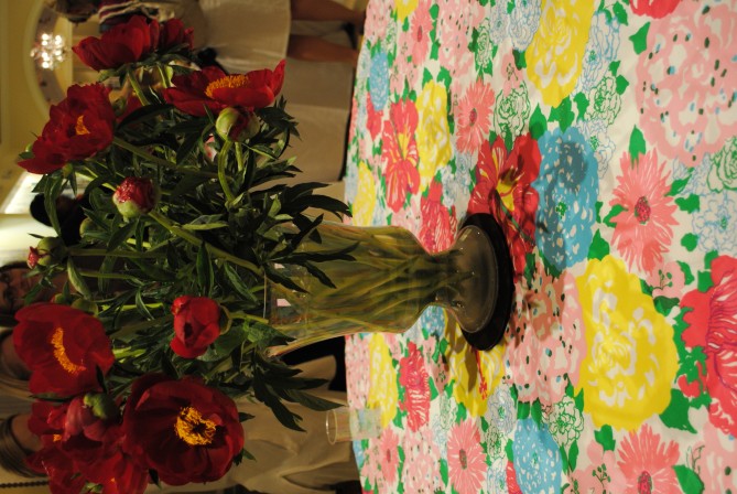
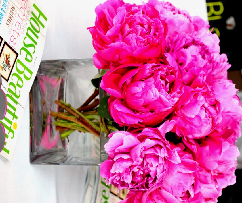
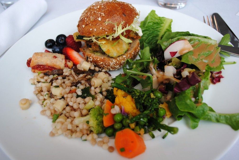
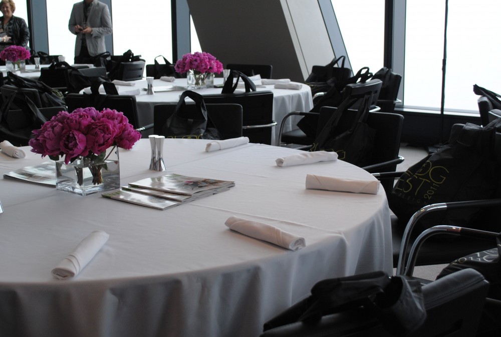
I’m back from Blogfest and am almost fully recovered; chatting with so many amazing bloggers  and designers can really wear a girl out! But I have lots to share and thought I would start with first part of conference held at Hearst Tower. The opening lunch hosted by House Beautiful was gorgeous — peonies were the unofficial flower of the event, everyone was taking advantage of their short season. And do you see those giant bags on the chairs? These were the swag bags of all swag — magazines for days and my favorite freebie, a copy of the new book, House Beautiful Blue: 360 Ways To Decorate With Blue. I already started to pick through it on my train ride back and it’s beautiful.

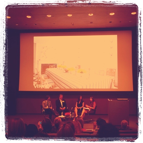
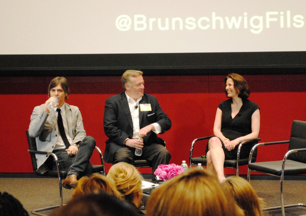
Following the delicious welcome lunch and after making lots of new friends (whose blogs I’ll share later in the week) we listened in on a panel discussion with Hearst editors Newell Turner of House Beautiful, Dara Caponigro of Veranda, and Mark Rozzo of Town & Country. All three were incredibly gracious and very open when talking about magazines’ relationship with blogs, they all agreed that there’s a place for both mediums in the space. In fact, they called on bloggers for being the beat editors that find trends and sources in the places that big magazines don’t have the time or staff to cover. My favorite moment of the day was when Newell Turner proclaimed he maintained a no-diva policy at House Beautiful, he doesn’t waste his time on that — which is probably why the magazine has such a down to earth feel to it.

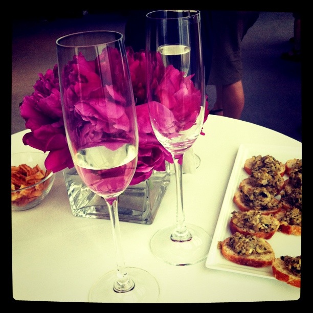
Then we capped off the day with some champagne before we were whisked off to the ELLE Decor Modern Life Concept House … more on that tomorrow!

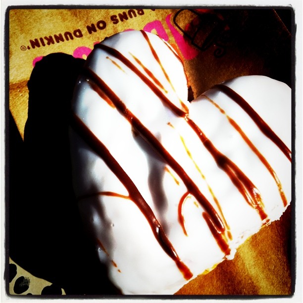
I had a mini-viewing party with one of my best girls — we woke up and started watching at 5am with a spot of bubbly and then topped off the morning with some official “Royal Wedding Donuts” from Dunkin Donuts. It was so fun to watch! I can’t imagine how amazing it must be to view in London today. I’m a sucker for weddings so I thought it was incredibly romantic, I especially loved the moment when you could read Prince William’s lips mouthing “you look beautiful” to his bride to be. And I loved the dress, it was perfectly timeless. So tell me, did you watch the Royal Wedding this morning? The dress? The kiss? Let me know what you thought!


Verified by MonsterInsights